Very – YCN Brief
CWDP: Reflective Summary
Within this short reflective summary for the Contemporary Web Design Practice module, I will be assessing my future goals along with methods for remaining current within the web design industry.
Future Goals
My first personal future goal is to graduate and achieve my degree in Web Design/Digital Media, this will be an important achievement for me as I feel that I have worked hard on trying to improve my design and technical skills over the duration of the course. Along with being able to meet deadlines and working amongst cohorts. Having graduated, I would like to achieve a job as a Web/User Experience Designer. I feel that this is a more suited job to myself as it involves working alongside a design team such as web designers, developers and editorial teams to determine user experience across multiple platforms and devices. This involves creating prototype designs, solutions and communicating with clients wants and needs. Another long-term personal goal may be to take a college or evening course in a design or IT related topic, to expand my skills for future prospects and possibilities.
Methods For Remaining Current
In order to remain current and on top of web trends within 2013 it is important for designs to include a variety of features such as, responsive layouts – allowing users to access sites dynamically over a variety of devices. Retina support – Retina screens are basically twice as dense as any average LCD, so they are the same number of physical pixels, but digitally twice as many pixels can be fitted into the same physical space. Fixed header bars – Using the CSS position: fixed; property is a great way to staple a header bar onto your website. A feature which can work on practically any website. Large photo backgrounds – eye-catching & attention grabbing, creating an overall clean and simplistic design. CSS Transparency – control to generate transparency in any modern web browser, meaning no Photoshop required. Social media badges – a huge expansion in social networking sites has generated a huge demand for social networking icons, sticker and badges to be included within any website. These are just a few examples of trends that are current right now in 2013 however, for future trends in 2014 will be continuously expanding into markets such as Google glasses – allowing a hands free access to the web, a product which is predicted to be released in 2014. This could mean an expanding market for web developers, and a new canvas to work with in terms of web designs.
CWDP: Website Evaluation
Contemporary Web Design Practice
Interactive Online Magazine – Very
For this web assessment I decided to expand on my design and layout skills, as presented in the Design Practice module, where I entered a student brief for Very by creating a personalised fashion diary. This gave me the basis to start with a couple of designs, in order to start expanding and creating an online magazine for the Contemporary Web module. This also helped me to expand my coding skills using HTML, CSS and jQuery.

As you can see from the above screenshot, this is the homepage which I have created for the Very online magazine. For the header of the site I decided to include the Very logo combined with a collage of prints advertising various Very products, I felt that by doing this it is a eye-catching way to entice the user into navigating around the site. As Very’s logo is a ‘hot’ pink, I decided to use a gradient pink background, starting for white at the top of the page and dark pink when scrolling down to the bottom of the page. I found that by doing this it made the content of the website stand out, whilst linking with Very’s brand identity. I then used a light grey for the body of the site, where the magazine feature is displayed, I decided not to use white as I felt that this gave the site too much white space. I also felt that by using the light grey this complements the darker grey drop down navigation, previous and next tabs.
In the above screenshot, you can see how the drop-down navigation will interact once the user hovers over it. This displays the list of magazine pages inside. Once the user hovers over each link, the text will turn from white to dark grey. Enabling the user to click on the link and to navigate straight to the selected magazine page.
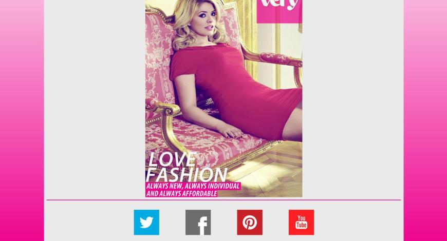
When the user scrolls down to the bottom of the home page, this revels the footer where the social networking links are displayed, along with copyright information. As you can also see by the above screenshot the whole of the magazine front cover, which is quite simplistic including Very’s logo (with the opacity brought down slightly), the image of Holly Willoughby advertising her clothing range, and the magazine style typography at the bottom of the cover. I didn’t want to include too much within the magazine cover, as I felt that this might distract the user by giving them too much to look at due to the selection of imagery already included within the homepage.
Here, you can see that when the user hovers over any social networking image, the image will turn grey. This notifies the user that this is a link, once the user clicks on the rollover image they will navigate to the selected social networking site, where they will be able to explore and connect with Very some more. 
Once the user navigates via the next tab, drop down navigation, clicking the right side of the page, or using the keyboard arrows the magazine will turn and open into a double page spread. This navigates the user away from the magazine cover, showing them the first two pages of the magazine being the content and welcome page, where there is some brief information informing the user about the content of the magazine. You can also see from the above feature that when the user hovers over the next or previous tabs the text will turn from white to grey, again informing the user of a link whilst matching the drop down navigation style.
When the user navigates to the next two pages of the magazine they will be displayed with the ‘connect with very’ page which enables the user to see live Twitter feed, and giving them the option to interact with the feed within the page without navigating away from the site. On the right hand side ‘the very latest’ page is displayed where the latest advertisement or trends are shown. Here the user is able to interact with the content by clicking on the play button of the video. Again the user is able to watch the content without navigating away from the site, whilst also being able to pause the video, turn the sound up or down and expand the video into full-screen viewing mode. As you can also see from the above screenshot, on the right hand side of the page – when the user hovers over this area of the page (left or right) the page will rollover slightly revealing a snippet of the next or previous page, enticing the user to turn the page.
The next double page spread includes the Ted Baker and Body-shape layouts where the user is able to view the displayed products and content. The user can interact with these pages by clicking on them, which will navigate them to the featured brand/style on the Very site. This will open in a new tab within the users browser.
Similar to the above layout, the For Him page layout again shows some of Very’s products whilst informing the user of the brand/price. Again the user is able to click on this page layout and navigate to Men’s section within Very’s website (opened on a new tab bar within the users browser). The page on the right named ‘product review’ included a comments feature where the user is able to type their name and a comment to leave posts about products that they have purchased. On this page the user is able to see and interact with other users post by reading, liking or disliking the comment, whilst also being able to log in through Facebook or Google +.
The next layouts (brunettes & holiday shop) again display various products and content and enable the user to click on each page to navigate to the correct section within the Very site.
The next 3 double spread pages include celebrity inspiration layouts, which are the celebrity faces of Very. Within the Fearne Cotton layouts the user is able to click on the left hand page to navigate to Fearne’s rage on the Very website, whilst on the right hand page the user is able to watch video content & also click to shop Fearne’s range by clicking on the Shop Fearne’s range ‘here’ link.
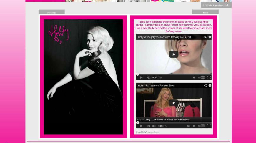
Holly double page spread – Left page, image navigates to Holly’s collection on Very’s website. Right page – video content, clickable link at bottom of page to navigate to Holly’s range.
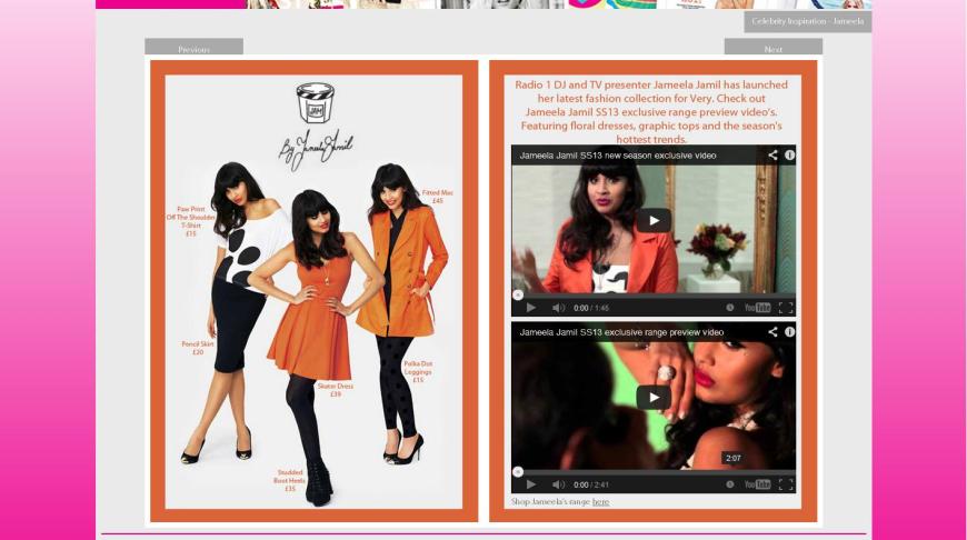
Jamella double page spread – Left page, image navigates to Jameela’s collection on Very’s website. Right page – video content, clickable link at bottom of page to navigate to Jamella’s range.
The last two double page spreads within the magazine are style corner & the with love final page. The style corner page include a questionnaire/poll which the user is able to select an answer for and vote. The user is also able to see how many other people have voted & what for (voting remains anonymous). The final inside page is simple for design purpose & advertisement for Very.
Finally, when the user navigates to the back cover of the magazine this include Very’s tagline and url address. When the user clicks on this page it will navigate to Very’s home page within a new tab on the users browser.
Overall, I am happy with the design and functionality of this online interactive magazine. I also feel that if this site was developed and expanded this could be a potential proposal idea or pitch to Very for an online expanding market. This is also a fun interactive way of demonstrating print on the web. However, as a magazine as a whole I feel that it needs more content/pages although due to time restriction and other university deadline’s I was unable to do so. Although, I feel that the pages and content include demonstrate the concept and ideas well. I also would have preferred to include rollover image links for each of the products, so when the user hovers over a product this would display a rollover effect and navigate to that unique product. Unfortunately, due to time restrictions and other commitments I was unable to do so, as when experimenting this would have meant that I would have needed to change most of my designs/page layouts. Therefore, this is why there is only one link per design/page layout.
MPP: Project Evaluation
Project Aim
- Completion of interactive band website
- Completion of brand identity designs (Logo, EP & Album Cover)
- User testing survey
- Research and development – as shown on blog
Client
For my major practical project, I decided to work alongside a client. My client being a start-up indie/rock band named Button Down Disco, formed at Northampton University. The band was in need of a brand identity & website, this is where I came in.
Research
To begin my research in developing my ideas for logo, EP and album cover designs to form the bands identity I began looking at a range of logo designs, hand-drawn fonts & typography. Including looking at various graphic designers such as Vaughan Oliver, Barney Bubbles & James Victore to name a few. This research can be found in the list of links below;
https://charlottelwood.wordpress.com/2013/02/04/design-dna-logos/
https://charlottelwood.wordpress.com/2013/02/06/handwritten/
https://charlottelwood.wordpress.com/2013/02/07/research-vaughan-oliver/
https://charlottelwood.wordpress.com/2013/01/22/research-barney-bubbles/
https://charlottelwood.wordpress.com/2013/01/11/research-lust/
After the completion of my brand identity designs (3 logo variations, EP single cover & album cover) I then began to research music/band websites to develop my ideas for the website, how users were going to interact with it and the features that I was going to include within the website. This research is displayed within the following link;
https://charlottelwood.wordpress.com/2013/03/20/website-research/
Plan
In order to plan my project, I set myself regular deadlines in order to complete the brand identity designs, communicate with the client efficiently and allow enough time to design & develop the interactive website. This allowed me time to edit and change my designs, whilst maintaining feedback from the client and tutors along the way. I found that the lengthy part of the project was learning the jQuery booklet features, used to implement the interactive album within the site. jQuery is something that I haven’t learned or used before, therefore the learning progress added to the project, which I again had to plan for time. Along with implementing and experimenting with some HTML5 and CSS3 coding.
I also purchased a domain name and hosting space on a server at the start of the project, in order to upload my website live to the web when having completed my project. Although, when trying to upload to the server I experienced a ‘403 Forbidden’ error which effectively I should have planned a contingency stage within my project, to allow time for anything that went wrong. However, I managed to upload the website eventually in time for the deadline.
Design/Build
When designing the logo variations, EP, & album cover, I wanted to create a brand identity, therefore I wanted to link the designs together to form an identity recognisable by fans and the public for the band Button Down Disco. In order to do this I wanted to portray the bands characteristics and music genre throughout the designs. Due to the band being an indie/rock back I wanted to give the design a rough and hand-drawn look, which is why I selected the chosen typography used within the bands designs.
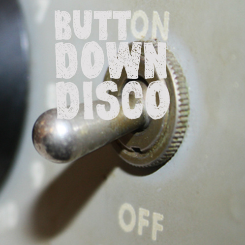
When designing the EP cover I wanted to include a ‘pop’ of colour and texture within my design, giving it that rough indie/rock feel to it. I also feel that it stands out as a single cover if displayed amongst a few. Due to the hand-drawn style font that I have selected for the typography within the designs, I decided to implement the logo on a larger scale within the album cover design. I also wanted the album cover to be fun and quirky whilst maintaining that rough edge, hence why I have missed out the ‘on’ in ‘button’ to display the ‘ON’ / ‘OFF’ switches as displayed within the album cover background image.
When developing my designs for the website I decided to do a photo-shoot and take photographs of all the music instruments/objects lying around my house. This is when I came up with the idea to include amplifier switches within the header of the site & a trailing lead for the footer. Again, I feel that this gives the website a slight edge and uniqueness about it, whilst also maintaining the music/switch theme used within the album cover design.
As the band are a start-up band I was limited to resources at first, such as music tracks, videos & images and it wasn’t until a very late stage within my project that I actually received these from the client. Once having received all the relative content I managed to implement them within the website, in the form of an interactive album cover. I chose to use this design feature within the website, as when conducting research I found that interactive magazine exists on the web, but so far I have not come across an interactive album cover which is displayed as a functioning live site for music or a band, such as I have done. I also felt that this would develop my skills throughout design and coding, and I am very passionate about music as a whole, therefore I had a great enthusiasm for the project.
Test
Having completed the website to a stage which I was happy with, I then handed out 10 user testing surveys to a range of people. This helped me to gain relative feedback and allowed me to make any changes to my site accordingly. The user testing survey & results can be viewed by the following link;
https://charlottelwood.wordpress.com/2013/05/07/user-testing-survey-results/
Solution
Having stated within my brief that for my major project I was going to complete a brand identity (including logo, EP & album cover design), interactive album website for the band & a user testing survey. I have completed them all effectively, to which the band are happy with the designs & functionality of the website.
Evaluate
Overall, I am happy with my project and have fulfilled my brief. I am also pleased with the learning process that I have gained, being following a project through from research to development to completion, alongside working with a client and adding to my portfolio/set of skills. However, if I could change anything within my project it would be that I may have implemented more colour throughout my designs, solved the contact form error when submitting and implemented a fully working mp3 player within the site, rather than through a link. Having had more time/experience I would have implemented the site within a CMS (content management system) to enable the band to upload content easily themselves. Although, due to time/lack in coding skills I didn’t manage to fulfill these for the university deadline, but these will be aspects that I will carry on working for in order for completion for the client.
Website Overview
Major Practical Project
Website Overview
Client: Button Down Disco

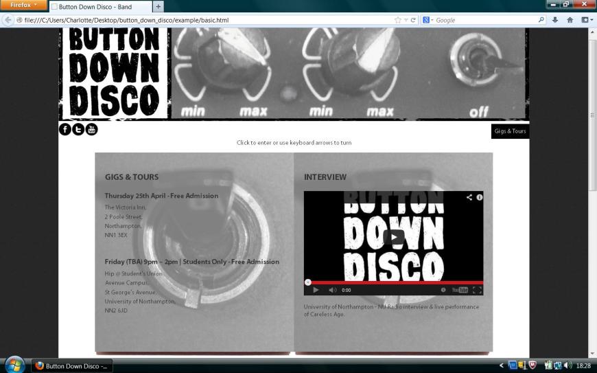
As you can see from the above image,I have maintained the same style and colour scheme to the logo & album cover which I created for the brand identity pack. Therefore, this is why I have included the bands logo with a photographed image of amplifier switches to link to the album cover imagery. I also used black & white along with grey tones throughout the web design to give it that rock feel to it, due to the band being of the indie-rock genre. When the user clicks on the header this will take them back to the homepage. The social networking stickers are also linked to the correct networking site when clicked. You will also see a rectangular block of black over in the top right hand corner, this is the drop down menu which is activated once hovered over. Below is the main feature of the site itself being the interactive album cover, which can be navigated by using the navigation bar, keyboard arrows, or by clicking the corner of the page to turn.
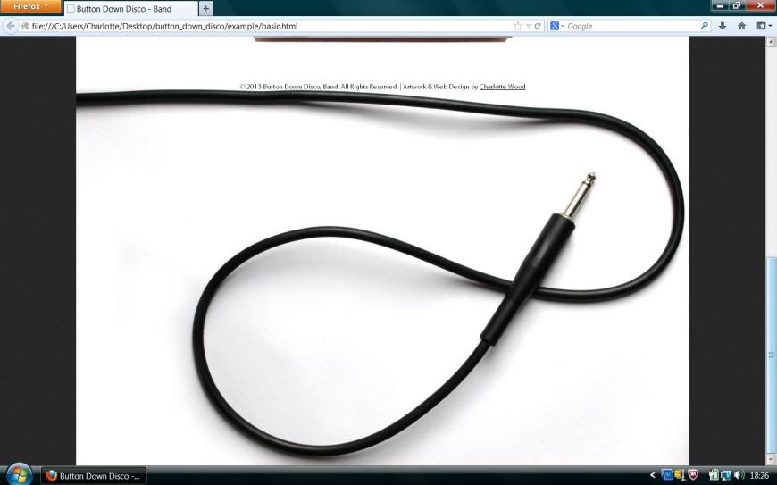
When scrolling down to the bottom of the web page there is a large footer image of a trailing wire (used to plug a guitar into an amp), along with the copyright information, along with a link to my personal portfolio website. Large footers seem to be a popular web trend at the moment, and I also felt that once I photographed this image it would continue well with the overall theme and style of the site. You may also notice that the site is centered within a container, I decided to do this as I felt it detracted from using too much white space. The background is dark grey and has a grainy textured feel to it, which reminds me of the noise/sound of a music environment, therefore I felt this complemented the site well.
When the user clicks or navigates from the album cover, the page will turn and open out to a double page spread, much like and booklet included within a CD album. The first page of the site is the about page which gives a short summary about the band, who they are and how they formed. The second page of the site is ‘news’ where the user can keep up to date with the band and what their doing, in this case there is interactive video content, based on the bands next gig which is available for the user to click on and watch within the page. 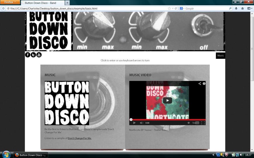
The user can then navigate to the music page where another variation of the bands logo is shown and there is a link to an mp3 player of the bands new sample track. On the music video page, there again is more video content – this time displaying their EP recording, which again the user can watch within the page. 
The next double page spread is the bands gallery, where there are 8 thumbnail images displayed of the band members. Due to the images supplied to me being of a low quality and small size this is why I decided to edit the images to be small square thumbnails, using a black & white tone and vintage border. Again, my reason for designing the images like this was in order to fit with the overall them and style of the site.
The gigs & tours page is a text-based page informing the user/fan on when and where the band will next be playing and the interview page is a video of the bands interview at Northampton University along with a live performance, which again the user is able to watch within the page.
Finally, the album will close showing the album cover again, which is a promotion/advertisement of the band’s album coming soon. As the band are a start-up band their songs are mainly demos or samples at the moment, however once the band have progressed maybe I can create a back cover to the album, using different imagery and listing the bands song tracks.
User Testing Survey & Results
As specified in my brief I have created a user testing survey to measure the response of user interaction on the website that I have designed and created for the band Button Down Disco. In order to do this, I created a short survey including an array of questions based on design and usability.
The attachment below is a pdf document of the survey which I created and handed out to 10 users for feedback.
Results
Did you find the site easy to navigate?
Strongly agree: 3
Agree: 6
Undecided: 1
Disagree: 0
Strongly disagree: 0
Did the site give you all the relevant information needed?
Strongly agree: 1
Agree: 6
Undecided: 2
Disagree: 1
Strongly disagree: 0
Would you visit this site again?
Strongly agree: 4
Agree: 3
Undecided: 3
Disagree: 0
Strongly disagree: 0
Would you recommend this site to a friend?
Strongly agree: 2
Agree: 4
Undecided: 4
Disagree: 0
Strongly disagree: 0
Are you satisfied with your site visit?
Strongly agree: 2
Agree: 8
Undecided: 0
Disagree: 0
Strongly disagree: 0
Please tick the two features that you like the best, and then explain why:
Interactive booklet feature: 9
MP3 player: 0
Video content: 4
Twitter widget: 6
Facebook widget: 1
Contact form: 0
Why did you like these two features the most?
Good interactive & social features, able to connect with band easily.
Fun interactive features.
Good interactive feature, good use of Twitter widget, making it easier for users to communicate with the band.
Allowed me to navigate & communicate through the website easily.
Combined interactive feature makes the site an interesting user experience & able to explore music in a new way.
A feature that I haven’t seen used on the web before. Social interaction easily used.
Easy to use, interactive & fun.
New fresh idea, user friendly & interactive.
Easy to use, informative, user friendly.
Fresh, innovative & easy to communicate.
Please check the two features you like the least, and explain why:
Interactive booklet feature: 0
MP3 player: 8
Video content: 1
Twitter widget: 1
Facebook widget: 2
Contact form: 8
Why did you like these two features the least?
Links to social networking sites located at top of web page & within site. Does user need both?
MP3 opened in a new window. Contact form could have been included elsewhere.
The mp3 player could have been better designed, not a link. Contact form didn’t fit with rest of sites design.
MP3 player could have been designed better. Error when using contact form.
Video could have been larger, contact form unable to work for me.
MP3 player could have been an app not a link, contact form didn’t work properly for me.
Error on contact form. MP3 opened in new window.
MP3 player opened in link – should it be doing this? Error on contact form.
Error when submitting contact form. MP3 – use play button instead?
MP3 opened in new window. Facebook widget not really needed due to stickers at top of page.
What are your overall impressions of the website?
Fun, user friendly, interactive.
Good.
Interactive band/music website.
Fun music website.
Clean & easy to use.
Fun music site.
Good design, clear navigation.
Fun website.
Interesting music website.
Fun music website.
If you could make one significant change to this website, what would you make?
More text content.
More information – text based.
More information within the footer or smaller image.
More dynamic web pages.
More colour within the design.
More information & instructions on how to use.
More content.
More colour used throughout the design, easier for user as a fixed page layout?
None.
More readable content.
Do you have any other questions or comments about the website or your experience with it?
Why did you choose to use the interactive booklet feature?
Why is the footer image so large?
Why did you choose this layout & feature?
Why mainly grey as a colour scheme?
Comments for users? (To discuss bands music?)
Why did you choose your font?
4 people did not answer this question.
Rate the following as True or False:
The homepage is attractive; True: 10 False: 0
The overall site is attractive; True: 9 False: 1
The site’s graphics are pleasing; True: 10 False: 1
The site has a good balance of graphics versus text; True: 2 False: 8
The colours used throughout the site are attractive; True: 1 False: 9
The typography (lettering, heading, titles) is attractive; True: 7 False: 3
The homepage’s content makes me want to explore the site further; True: 9 False: 1
It is easy to find my way around the site; True: 7 False: 3
I can get to information quickly; True: 9 False: 1
It is fun to explore the site; True: 9 False: 1
It is easy to remember where to find things; True: 3 False: 7
Information is layered effectively on different screens; True: 1 False: 10
The homepage is attention-getting; True: 8 False: 2
Information is easy to read; True: 10 False: 0
Information is written in a style that suits me; True: 5 False: 5
Screens have the right amount of information; True: 0 False: 10
The site effectively communicates the band’s identity; True: 9 False: 1
The site is designed with me in mind; True: 8 False: 2
The site’s content interests me; True: 6 False: 4
The site’s content would keep me coming back; True: 6 False: 4
The site has characteristics that make it especially appealing; True: 9 False: 1
The site reflects progressive, leading edge design; True: 8 False: 2
This site is exciting; True: 6 False: 4
The site is well-suited to first-time visitors; True: 0 False: 10
The site is well-suited to repeat visitors; True: 10 False: 0
The site has a clear purpose; True: 0 False: 10
I always felt I knew what it was possible to do next; True: 1 False: 9
It is clear how screen elements (e.g. navigation menu, video content & social networking widgets) work; True: 10 False: 0
Survey Feedback
Merchandise Designs
Along with the brand identity designs, of which I created 3 logos, an EP single cover & album cover for the band. I decided to create the template merchandise designs which could be used for the band to sell at gigs. The merchandise pack includes a women’s t-shirt, men’s t-shirt & canvas bag design, as shown below; 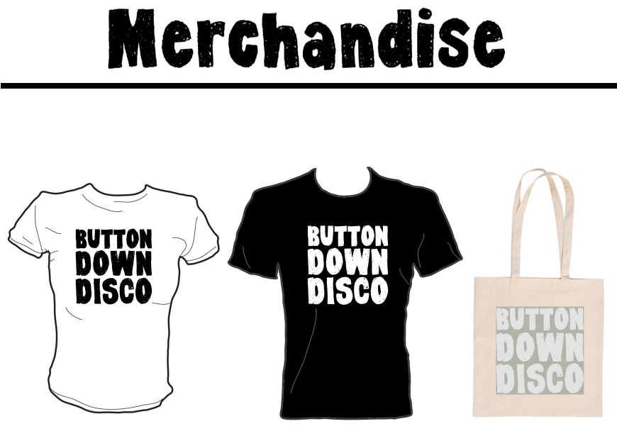
Brand Identity
Here are my final brand identity designs for the band Button Down Disco. The brand identity pack includes 3 logo variations, EP single cover & album cover. Overall, I am very happy with the designs for the band & having shown the client they are very happy with them too. I think they display the bands characteristics and indie/rock sound well.
Logo – black on white
Logo – white on black
Logo – off grey on grey
EP – single cover
Album cover – CD
Brand Identity Pack


